Reading Performance Reports
The HTML report is the primary output of every PerfGuard run. Learn how to read every section, spot real regressions, and share findings with your team.
Report Overview and Structure
PerfGuard generates a single self-contained HTML file with no external dependencies. Chart.js is embedded inline, all data is inlined as JSON, and styles are included in the file. You can open it in any browser, email it, or attach it to a PR.
The report is organized top-to-bottom, from high-level summary to detailed analysis:
- Banner — immediate pass/fail signal
- Executive Summary — plain-English health overview
- Per-Scenario Tables — stat-by-stat comparison data
- Trend Charts — historical performance over time
- Histograms — frame time distribution
- Hitch Analysis — frame spikes and their causes
- Diagnostics — memory, capture quality, thermals
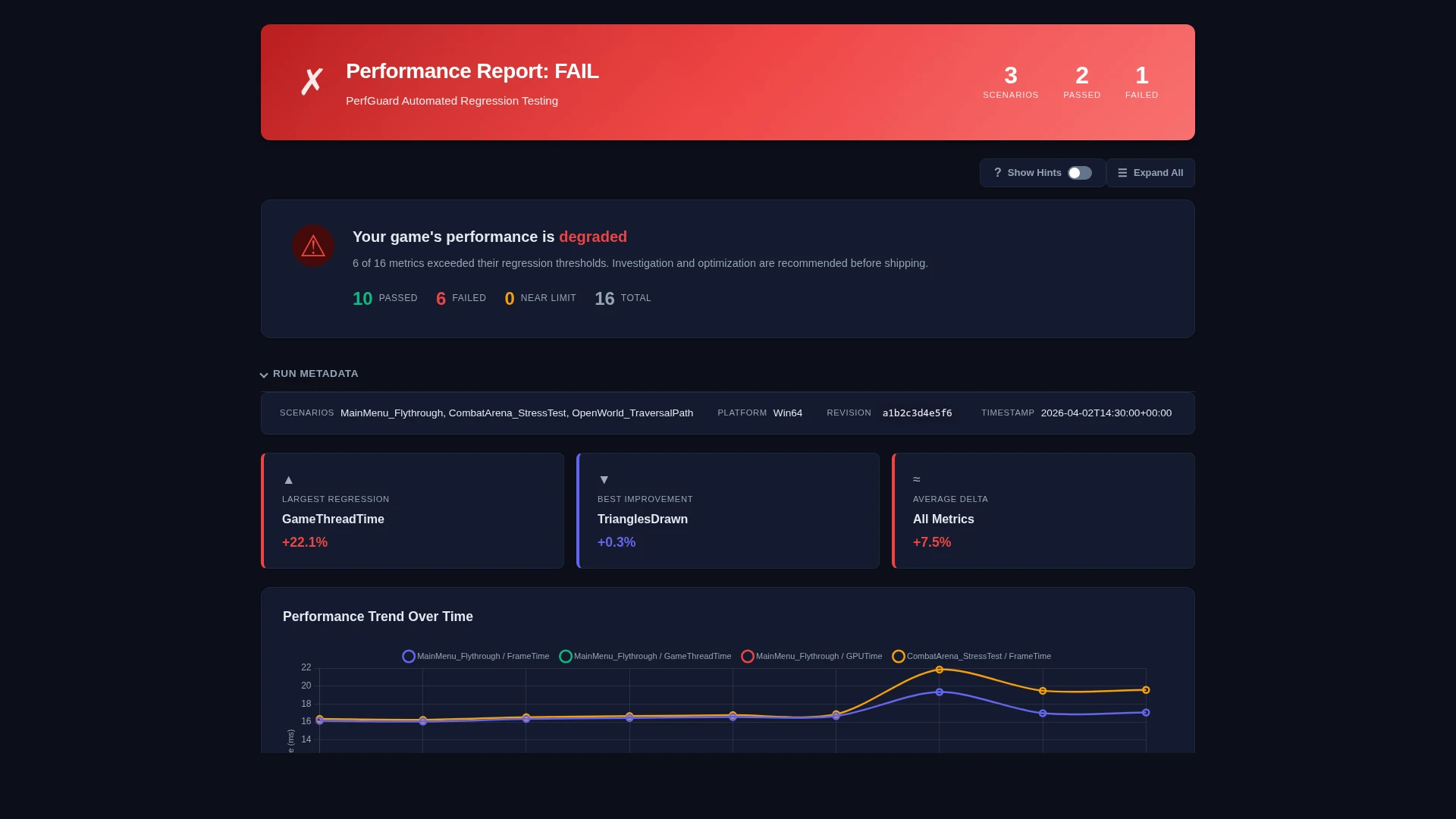
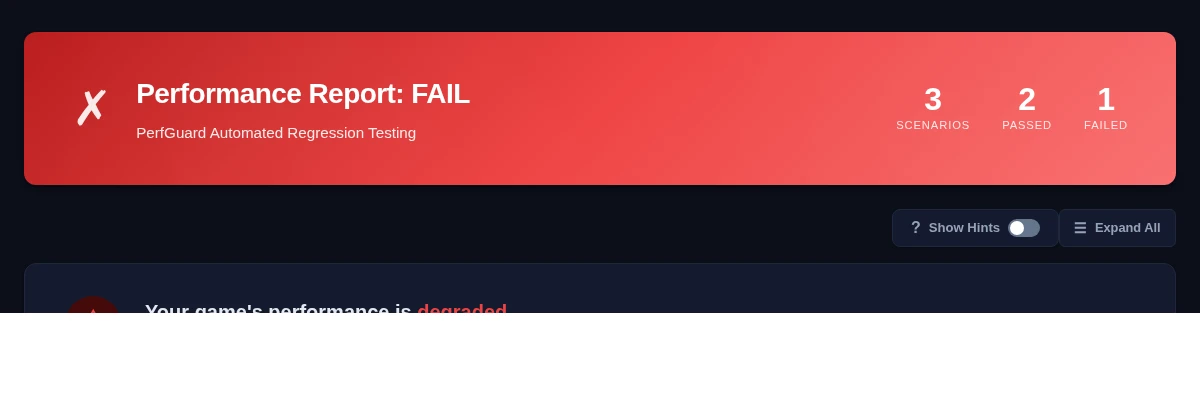
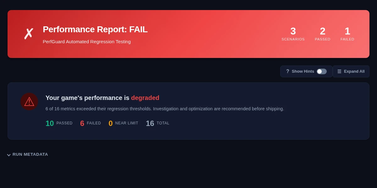
The Banner: Pass/Fail at a Glance
The banner at the top of the report gives you the answer immediately. It shows:
- Green / PASS — All scenarios within threshold. No action needed.
- Red / FAIL — One or more regressions detected. Scroll down for details.
- Amber / WARNING — Marginal results or data quality issues. Review recommended.
The banner also shows the build label, timestamp, platform, the number of scenarios tested, and the source revision (the git commit, Lore revision, or Perforce changelist of the build under test).
Executive Summary
The executive summary translates raw numbers into plain English. It's designed for leads and producers who need to understand impact without reading stat tables. It covers:
- Overall health assessment
- Which scenarios regressed and by how much
- Whether frame budgets are being met
- Key recommendations (e.g., "investigate GPU time increase in Arena level")
Per-Scenario Tables
Each scenario gets a detailed comparison table showing every tracked stat with:
- Baseline value — The reference measurement
- Current value — The new measurement
- Delta — Absolute difference (ms, count, etc.)
- Delta % — Percentage change, color-coded red/green
- Threshold — The configured tolerance
- Status — Pass/Fail badge per stat
Tables support filtering by stat group (timing, memory, rendering) and can be exported to CSV directly from the report.
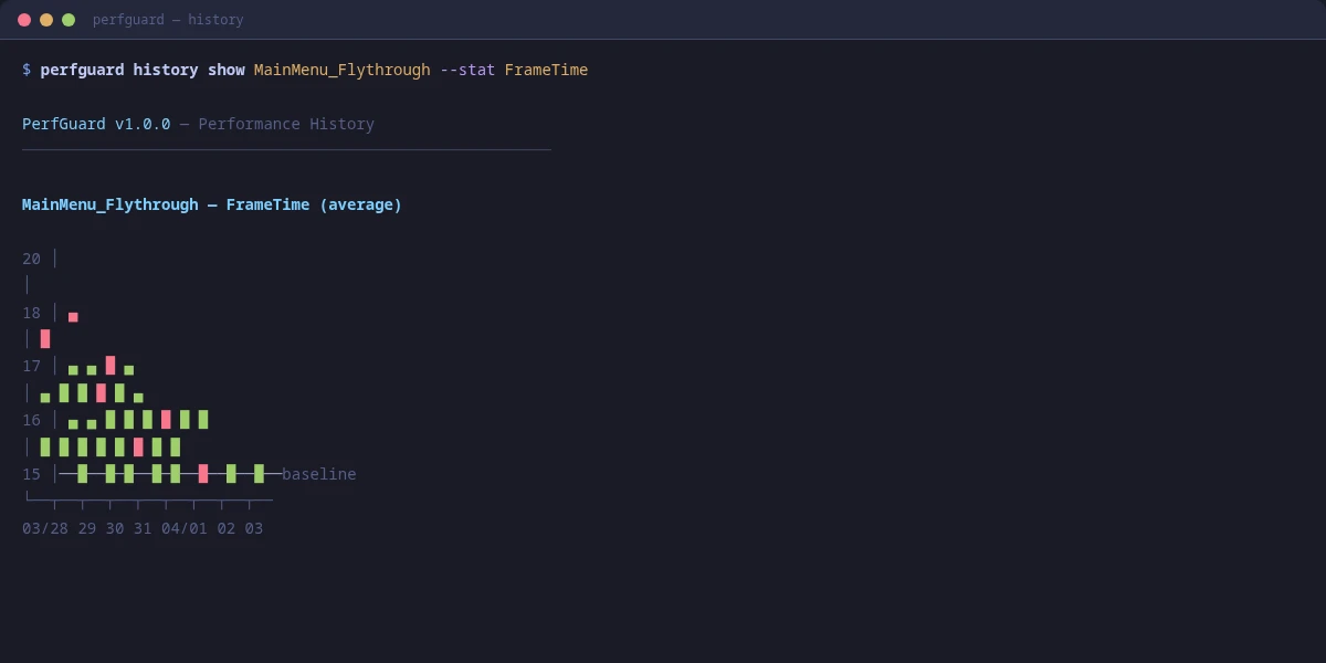
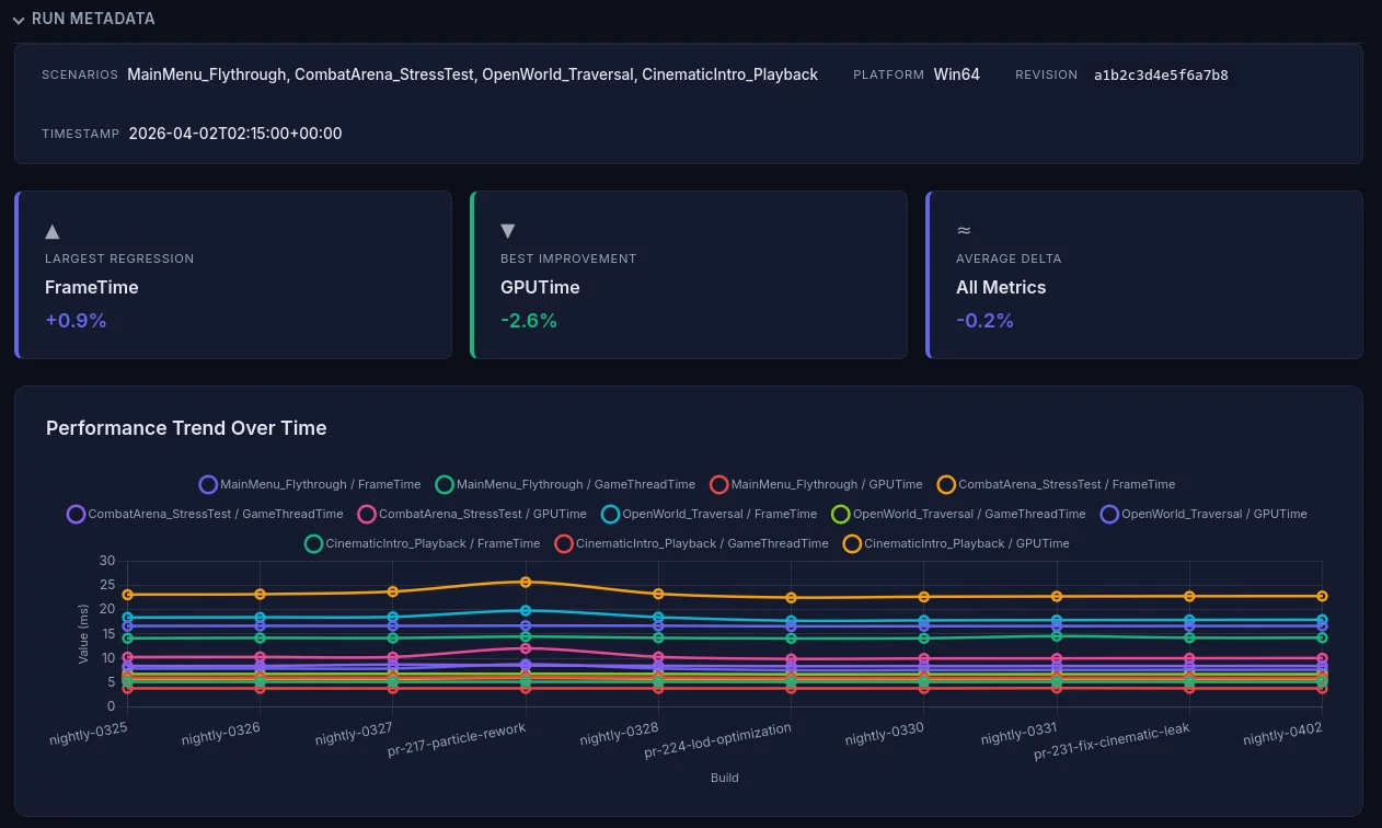
Trend Charts
If you have run history enabled, trend charts show how each stat has changed over time. This is invaluable for spotting gradual regressions that stay under threshold but accumulate.
Each chart plots the stat value (Y axis) against build labels or dates (X axis). The baseline value appears as a horizontal reference line, and the threshold band is shown as a shaded region.
Frame Time Histograms
Histograms show the distribution of frame times, which tells a much richer story than the mean alone. A healthy distribution is a tight cluster well under budget. A problematic one has a long tail or bimodal shape.
Look for:
- Tight cluster — Good. Consistent frame times with low variance.
- Long right tail — Occasional hitches pulling the mean up.
- Bimodal peaks — Two distinct performance modes (e.g., streaming vs stable).
- Wide spread — High variance. Check for thermal throttling or background interference.
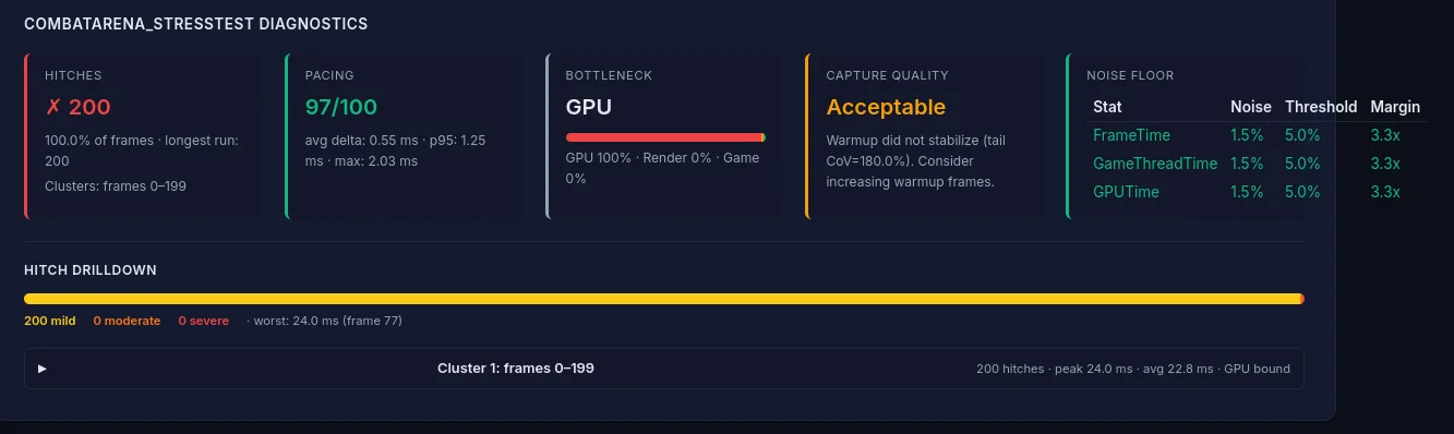
Hitch Analysis
The hitch analysis section identifies individual frames that exceeded the budget threshold and groups them by severity:
- Mild — <1x budget over threshold (noticeable stutter)
- Moderate — 1–2x budget over threshold (visible freeze)
- Severe — >2x budget over threshold (hard stall)
For each hitch, the report shows the frame number, duration, and bottleneck attribution (GPU-bound, game thread-bound, render thread-bound) based on which thread had the highest time that frame.
Hitch clusters (multiple hitches in close succession) are highlighted separately, as they indicate systemic issues rather than one-off spikes.
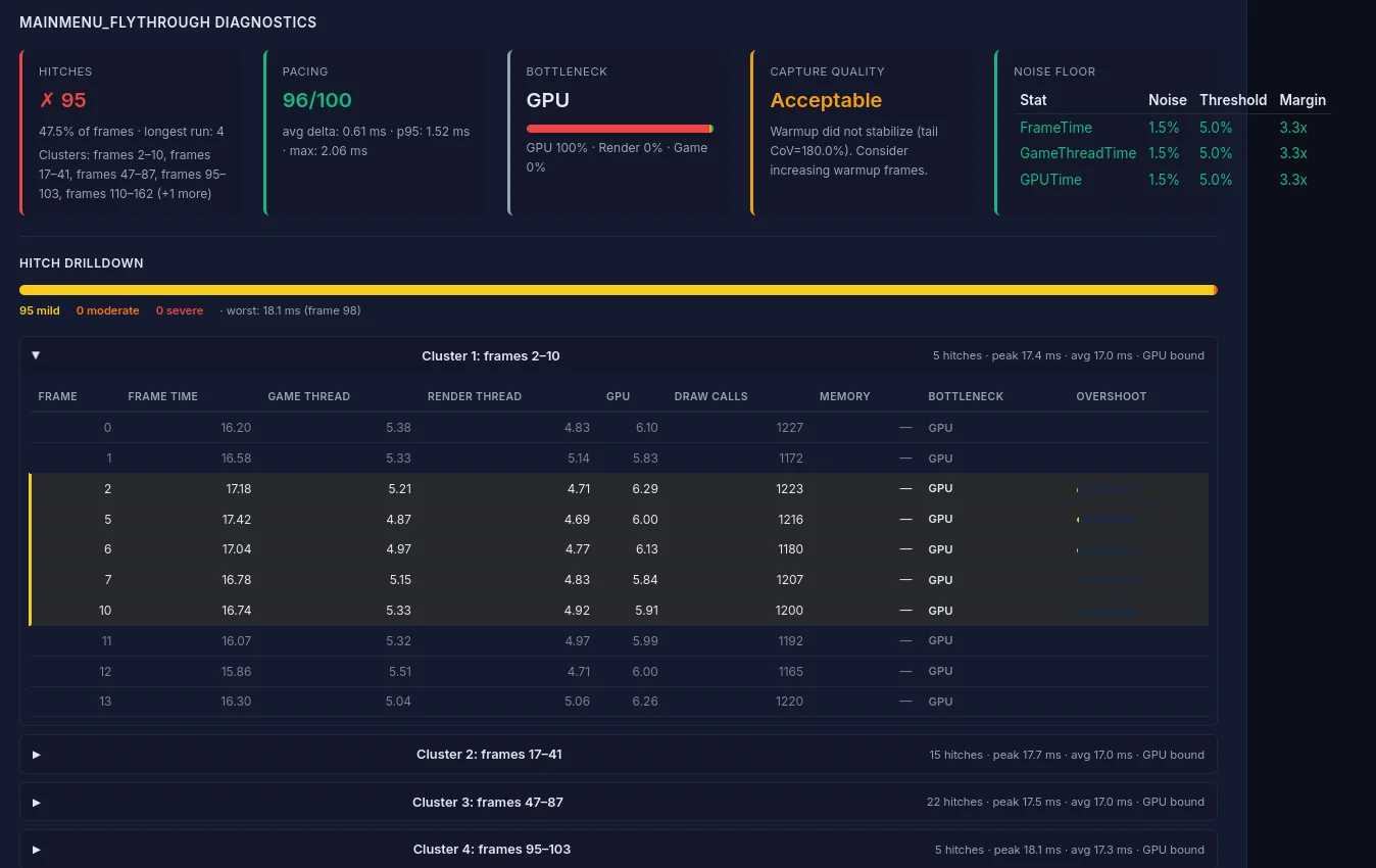
Performance Diagnostics
The diagnostics card provides meta-analysis beyond raw stat comparison:
- Memory leak detection — Flags monotonically increasing memory usage across the capture
- Capture quality validation — Checks for sufficient frame count, warmup adequacy, and data completeness
- Thermal throttle detection — Identifies frame time degradation over time that suggests thermal throttling
- Coefficient of Variation (CoV) — Flags stats with high variance that may produce unreliable comparisons
Dark Mode and PDF Export
The report follows your OS's color-scheme preference: light mode by default, automatic dark mode when your system is set to dark (prefers-color-scheme: dark). To force a theme for printing or embedding, change your OS preference, or use your browser's print dialog (which forces light backgrounds for paper).
To export as PDF from the CLI, use the --pdf flag when generating reports:
perfguard report Saved/PerfGuard/Results/ --pdfThis uses headless Chrome/Chromium to render the report to PDF. If Chrome isn't on your PATH, specify it with --chrome-path. You can also use the browser's built-in print function (Ctrl+P / Cmd+P) — the report includes print-optimized CSS that adjusts layouts, hides interactive elements, and ensures charts render cleanly on paper.
--pdf path renders against the print stylesheet automatically — no theme switch needed.
Sharing Reports with Your Team
Since the report is a single HTML file with no dependencies, sharing is straightforward:
- PR attachment — Upload as a build artifact and link from the PR description
- Slack/Teams — Drag and drop the HTML file into a channel
- Static hosting — Publish to an internal web server or S3 bucket
- Jenkins — Use HTML Publisher to serve directly from the build page
- Email — Attach the file or export as PDF